Wednesday, October 28, 2009

How to use house ads

In our newsletters this month we've been addressing ad placement and formats. One type of ad that is frequently overlooked is the house ad - an offer from your company.

The house ad began - and is still used as - a "filler" when ad sales had not been sufficient to fill available space. Typically it's used to promote the company, an ancillary product, or an event, such as a conference.

The shift in user perception of ads post-Web (can I trust this site? Can I trust this ad?) makes the house ad more powerful than ever. The key to success: Creating a close visual/messaging identification between your house ads and your primary Web brand. Why? Because your users came to *you*. They trust you.

Many site publishers err by thinking that they should make a house ad look like a third-party ad so "people will look at it." The sad truth is that people *will* look at it - then immediately dismiss it as an irrelevant ad.

Keys to success with house ads:
  • Clearly identifying the house ad as part of your company - retain logo, fonts, visual design
  • Labeling the ad "Offers from our company"
  • Labeling third-party ads as "advertisement"
  • Linking the ad to valuable content
  • As with all ads, contextual placement wins.
PROVIDE VALUABLE CONTENT

Link your ad to valuable content to generate traffic - but make sure it's branded as you. Above: What looks like a third-party ad is really a house ad for a useful service to locate a cigar retailer in your area.

CONSISTENT STYLE
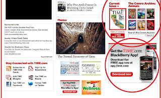
Keep house ads consistent with overall branding in terms of color, font, style. Above: An example from TIME.com.

LABEL HOUSE ADS
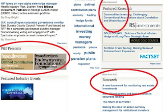
Clearly identify the house ad as coming from your company as opposed to a third party. Above: Examples of clearly labeled advertisements and house promotions.

Tuesday, October 27, 2009

The GOP Facebook Friendship Fairness app: Funny, or scary?

The new GOP.com has been thoroughly "reviewed" by the likes of Jon Stewart, who of course has comments outside the domain of this blog. The feature that captured my attention was the so-called Facebook Friendship Fairness app. From the site:

"How much longer will it be before you get the following notice from the new "Friendship Fairness Czar?

"Official Notice of Violation and Assessment of Friendship Tax:

"An audit of your Facebook account shows that your total number of friends is above the average of 120 friends for all Facebook users. The Friendship Fairness Czar has determined that you have an excessive and unfair number of friends and has devised a solution to spread the wealth of friendship. Please click on the Friendship Fairness Czar Facebook Application to be assessed your tax and become a fan."

Now, I know this entire site is attempting to present - literally - a new public face for the Republican National Committee. If that is the case, do they really want to lead off the Facebook initiative with the implication that they have snooped your Facebook account?

Privacy came to the fore in the last few years as social media collided with the "War on Terrorism." My take: If the RNC wants to create a new perception of itself - and this slick Web site starts to move it in that direction - maybe joking about privacy isn't the best way to go.

Just a thought.

Friday, October 23, 2009

How "nimble" should a Web site be?

Talking through Web strategy with a client today, we consider just how "nimble" a Web site should be - how frequently should a Web site redesign, based on changing mission priorities?

This is a particularly difficult question for large organizations with so much to say and no easy way to say it. Web sites that bend too far in the direction of the mission du jour may neglect content that is not part of that mission. The result for unsuspecting users may be "information paralysis," an overwhelming amount of content that could have been useful - had the user route been planned for those residing outside of the current mission priority.

Large associations and nonprofits frequently struggle with the challenge of meeting the needs of multiple constituencies. The solution is not to change the entry experience every time the organization takes on a new initiative; the solution is to create an information architecture that will continue to support known and ongoing constituencies, while creating a structural option that accommodates the changing initiatives of the future.

The time for "nimble" is in the planning and prototyping stages.

Wednesday, October 21, 2009

Least effective methods of online advertising

Online advertising felt the bite this year, with spending dropping in most areas. When budgets drop, it's even more important to spend limited dollars where you'll get the best return on investment. Below are a few of the least effective methods of online advertising.

These recommendations are based on best practices and current research. However, guidelines can't substitute for identifying and understanding your specific audience. Once you understand why the users are on your site and what they want to do there, you can provide better service and relevant, successful advertising that helps support your site.

Find out more about Interface Guru's user profiles and personas.

SIMPLE FLASH

Ads that use Simple Flash prove to be ineffective at driving purchase intent. A better choice is using rich media with video, which consistently ranks among the most successful methods at driving purchase intent. Above: Several simple Flash ads within the same page.

AD AS FRAME

Users have trained themselves to ignore ubiquitous ad types that frame content (banner ads, skyscrapers) - especially if they're animated. Above: A re-sized browser window would allow user to completely ignore the framing ads.

DELAYED BRANDING

Don't make users wait for it... they won't. You have mere seconds to resonate with the user, your message should be clear all the time. Don't play hard to get, hiding your brand and message until the end of the ad. Above: Company name is invisible throughout more than half of the 10 second ad.

Here are a few more resources to find out more about effective advertising:
• Google Analyzes Rich Media Ad Effectiveness (WebProNews)
• Online Advertising Spending Expected to Be Down for 2009 (AdAge and eMarketer)
• Video In Rich Media Ads More Likely To Lead Customers To Purchase (MediaPost)

Tuesday, October 13, 2009

Great ad - it's about relevant placement

Previously we talked about how important placement is in online advertising and how poor placement can make any ad bad. Now let's talk about which ad types are the most effective and bring the best return on investment.

NON-INTRUSIVE

"This could be good"
Ads that don't intrude on requested content don't annoy users. Text overlays on video windows take advantage of the un-used space without detracting from the desired video.
Above: A text overlay ad displays across the bottom of a video window without obscuring the content.


CONTEXTUAL

"I need one of those"
Users with "banner blindness" still respond to contextual advertising and good SEO. Users blind to popups and interstitials will still click on an ad when it's relevant to what they're already doing.
Above: Chart depicts ROI success per ad type.
(
source: Marketing Sherpa and Ad:Tech survey)

RELEVANT

"It applies to me"
Online articles that include related brand information work well on younger users, who view them as more trustworthy than random banners. Advertisements relevant to what users are already looking at are more likely to get traffic.
Above: Graph depicts which ad formats users are most likely to respond to.
(source: ARAnet AdFusion survey)

Monday, October 12, 2009

Agile development and UX: The heart of the matter

Re my recent post on developers and usability:

If the user experience practice in your company was weak before Agile, Agile development isn't going to help things.

If your user experience practice was strong before Agile, it'll remain strong after Agile, and evolve to adapt.

So says Jeff Patton, and I couldn't agree more. No matter how you approach user experience, you must set aside time and resources for it. It has to be in the company DNA - even if that value must be ported from an offline discipline.

Agile development provides fertile ground for user experience design. It may not provide as much support for usability. Regardless, user experience design - most notably including user-facing information architecture and usability testing - must be accounted for in budget and schedule.


When user experience meets advertising: Are tradeoffs worth it?

The average American consumer is no longer. says Peter Francese, a demographer at the ad agency Ogilvy & Mather. No lie. Without even beginning to delve into the many facets of that statement, we can tell you that the sawed-off shotgun approach to advertising is dead. At a minimum, placement and context for advertising is key. Permission - anticipating the user's receptiveness, and when it will occur - is an under-served art online.