
Tuesday, December 29, 2009
Sunday, December 27, 2009
Verizon: I love the Droid. I hate the Web site. How do I register for My Verizon?


On hold with Verizon for the second time after a dropped call... the problem is not my new phone or your great employees. It's - guess what - the My Verizon Web site! This is a great example of how brand experience must remain consistent from the Web (great promo site), to the physical store (great customer service), to the product (the rockin' Droid), and then back to the Web (broken Web site for account self-service). After much research on the Android phones, I finally settled on the Droid. I've had it for 24 hours and I love it. I got great service from Steve Liermann at Verizon's Park Place Tucson store (where I set a record for number of contacts transferred). And then... I tried to register for My Verizon Business version. Big mistake.
I've completed the registration form six times (twice in Safari, four times in Firefox). The Verizon rep is experiencing the same errors. Either the form asks me to input the business contact number (already there) or the wireless number (already there). There is clearly a bug in the form since the error toggles. Plus common interface problems (fields for phone number entry) that sure do look like sheer laziness.
After an override by the rep we finally got the My Verizon account set up. Time lost: Nearly one hour.
Verizon: Your network rocks. The Droid rocks. Your employees rock. Your My Verizon registration experience does NOT rock. The little laminated card you gave me with registration instructions says, "we've got your back." Not so much! It says all I need is my phone number. Not true.
This problem could easily be solved. We at Interface Guru would be happy to help.
If this is what buying the Droid via ecommerce would have looked like, I probably would have given up. Verizon! Wake up! Love ya mean it but fix this Web site!
Tuesday, December 22, 2009
Do you play the game or does the game play you?
 Over the past weekend, I had the opportunity to use my Nintendo Wii and explore a game called Silent Hill: Shattered memories. I found the game's use of the the interaction capabilities of the console noteworthy. I won't give a review of this game here; however there are many user experience and interaction concepts that are set forth in this game.
WARNING - major spoilers ahead for anyone looking to play the game.
1.) Adaptive psychological personalization. Before you get to the main menu, the game will give you the following warning:

The game tracks how you respond to certain criteria (as well as the in-game psychology tests) and alters major elements based on that data. The game’s monsters, major locations, even how secondary characters look and act will vary for each person that plays it.
2.) Wii Remote interaction. The biggest problem I have had with the majority of Wii games is that few titles fully integrate the Wii Remote capabilities into gameplay. This is not so in SH:SM. The main use for the Wii Remote is as the game’s flashlight (if the player waves the Wii Remote around, the main character will mimic the action in the game)…but that is not all. The Wii Remote also functions as a cell phone (the player will have to hold the speaker in the Wii Remote to their ear in real life to hear phone calls in the game – just like they would a real cell phone).
3.) Attention to realistic detail. You can also place calls in the game – if you see a phone number anywhere in the game the character can dial out to it. Very few of these phone numbers are directly related to the game’s main plot. They are simply there to increase the realism of the game environment. BELOW: The player can call something as unnecessary as a toy recall hot line.

4.) Natural actions. In SH:SM, a majority of the Wii Remote actions are natural actions. If a monster latches on to you from the side, you will have to make a sideways push motion with the Wii Remote to get it off of you.
5.) Cueing user interactions. The player is given control cues at the appropriate time in which they are relevant. The player is not overburdened with memorizing all possible Wii Remote uses at once. BELOW: The player is cued how to answer a call only when the phone rings.

6.) Real-world benefit. At the game’s end, the game’s psychologist will transcribe a detailed profile of the player’s personality. If you play through the game honestly, it is a fairly accurate representation of your psychological profile. BELOW: The start of a multi-page analysis of the player that runs over the game’s credits.

Silent Hill: Shattered Memories was released on December 8th, 2009 and bears a Mature ERSB rating (with good reason).
View a full walk-through of the game at this user's YouTube account.
- by Kyle Kulakowski
Tuesday, December 8, 2009
Coda: When should you worry about your reputation?
I was expecting blowback from yesterday's post on younger tech workers and ethical behavior.
It came.
When should you be concerned about your reputation and professionalism in a close-knit community?
BEFORE you take a action that will - rightly - make you look bad later.
My advice stands. Apologize.
As I stated in an earlier post: there can be no daylight between your policy (the way you act) and your PR (the way you want others to see you.)
Monday, December 7, 2009
Ethics and knowledgework: Do younger staff need a lesson on the Golden Rule?
This fall, I gave a talk at Tucson Startup Drinks on the need for legal formalities in small businesses. Those who own a business (i.e., incorporated, with employees and real obligations) knew exactly where I was coming from. Those who are currently employees had a different take - in my view, because they have never faced the painful and costly experience of having an employee or contractual agreement go bad, with all the attendant drama and chaos.
Recently, our good friends at Company A were compelled to terminate four employees who were conspiring - on company time and equipment - to start a competing firm.
Employees 1, 2, 3, and 4 are talented people. I liked them. They're also very young, and arguably got their start at Company A.
That start - and the visibility they began to acquire in a professional realm - was provided by Company A, whose president and owner has invested years of the sort of hard work that only other business owners understand. Taking risks, paying taxes, footing legal services, rent, insurance, and all the myriad not-fun chores that go into running a business.
The necessary termination of Employees 1, 2, 3, and 4 left Company A in the lurch during production of a very large project. (To its credit, Company A's remaining loyal staffers pitched in and made sure the project delivered successfully.)
Employees 1, 2, 3, and 4 immediately started Company B. As a parting shot, one of them posted a tweet slamming his ex-employer's blog with a link to a porn site.
Company B is now gleefully pursuing business, making nice to those who don't know the sordid details.
Interface Guru will never recommend Company B, no matter how good its future work may be, because they broke rule one: Do no harm.
Legal contracts and agreements - such as noncompetes and non-disclosure agreements - must be executed and enforced. But they are only as good as the ethics of those who sign them.
More seasoned employees are less likely to engage in this sort of nonsense because they know better. Enlightened self-interest, at a minimum, keeps more mature workers from burning bridges. Younger staff may feel immune. In time they will learn that, as that great philosopher Justin Timberlake would say, "what goes around comes back around."
This story could have had a happy ending. The future employees of Company B could have respected their employer - and themselves - enough to depart on good terms. They could have built on that relationship into the future.
Instead, they have insulted and damaged the company that gave them their start. And they've proen that they don't understand the sort of relationships that are the heart of sustainable, long-term businesses.
If Employees 1, 2, 3, and 4 were willing to deceive their employer, then start a competing business, how will they treat their clients? We're not about to let any of our clients, who we value for more than just the value of a contract, find out.
My advice to Company B: Apologize. And resolve to act ethically from now on. Else, one day you may well find the shoe on the other foot.
Life is full of hit-and-run types who seem successful. They may make money, but their consciences - if they have them - will never be clear. And at some point, everyone will know about the bodies they buried.
Ethics may not mean anything to some people, but they means the world to me, and to the good people that work for and with me.
Thursday, December 3, 2009
Tony Silber on corporate culture: What most of US business needs to hear
I was blown away by Tony Silber's blog post, "When Corporate Cultures Break, They Can’t Be Easily Fixed" (12/02/09). Using publishing company fiascos to illustrate his points, Tony outlines the wrongheadedness that is destroying businesses across America. Sound too strong? I personally see this far too often. Decisionmakers are laying the groundwork for failure by refusing to adapt to post-Web transparency while retaining the worst practices of the brick-and-mortar days.
The Web has removed the emperor's clothes entirely. Poor business practices that hid behind PR companies are now exposed. Your policy IS your PR.
Notable quotes:
"These companies have been through too many cycles of change in ownership, changes in management, downsizings, layoffs, salary cuts, loss of talent, loss of spirit, loss of camaraderie."
"Job one should be fixing the culture."
"He fell into the idea of protecting his turf rather than working for everyone else."
"...firing a lot of experienced, talented, knowledgeable people..."
And the saddest part, from our perspective: These problems manifest themselves in the Web presence.
Truly, collaborate or die.
Wednesday, December 2, 2009
How rules of engagement protect your brand online
The common definition of "Rules of Engagement" (ROE) is a military one. From wikipedia: "Actions a military commander may take without consulting a higher authority, unless explicitly forbidden (sometimes called 'command by negation') and second, actions that may only be taken if explicitly ordered by a higher authority (sometimes called 'positive command')."
What the heck does that have to do with your Web presence? Everything.
Note the definition: Actions that may be taken without consulting a higher authority, and actions that may only be taken if explicitly ordered. Given the freewheeling nature of the Web, companies and organizations must create some sense of order so that - as my colleague Sean Fitzpatrick is bound to say - there is "freedom within structure."
We commonly find that companies that are otherwise well-run have never created Rules of Engagement for their digital media teams. The result: Dilution of brand values, and a lack of consistency that is obvious to the user. In other words, lack of ROE leads directly to poor user experience - or worse.
Companies that allowed the Web to grow "organically" - which is to say, with no rhyme or reason - struggle the most with ROE. Managers are loath to approach staff who have become accustomed to doing whatever pleases them on the company Web site. This is a serious mistake.
The ROE conversation (here are the rules we all need to abide by, in terms of workflow, approval, tone) is not an easy one, but it is crucial. Avoiding the conversation, and the subsequent rules, will inevitably damage your brand.
The Web is rife with embarrassing missteps that companies would never have allowed to see the light of day in print or broadcast. Protect your brand by creating ROE, and enforce those rules. The issue is serious enough to merit a signed agreement, with termination as a consequence if staff deliberately ignore the rules.
ROE are a natural byproduct of Web strategy. Let us know if you need help establishing them.
Monday, November 30, 2009
Shiny New Toy Syndrome: Crippling your Web presence?
Is your Web presence hobbled by Shiny New Toy Syndrome?
Used to be that the CEO was most prone to Shiny New Toy Syndrome. (Actual quote from a major media boardroom: "ESPN's doing it... it must be working for them... why can't do that too?"). We tech types breathed a sigh of relief when Chief Technology Officers became commonplace, since the CTO is supposed to disabuse the CEO of the dancing sugarplums that usually surround Shiny New Toy.
Turns out CTOs are just as - if not more - susceptible to Shiny New Toy Syndrome (SNTS). Especially when pushed in a flashy new demo from an 800-pound-gorilla vendor. Why does this happen?
Vendor schmoozing aside, this happens because the company has not established requirements. Sure, the toy is shiny, but: Does it meet your requirements? Does it duplicate the functionality of an existing, better-developed tool? Will it create ROI, or will it add a maintenance burden that you didn't plan to meet? Or is this yet another instance of the technologist's worst nightmare: Wishful thinking?
Major American businesses, associations, and scientific projects are losing time, money, and opportunity to SNTS. We see it on far too many projects. The cure: The creation of objective requirements - based on a coherent Web strategy - that set a standard for selection and implementation of technologies.
Play is clearly more fun than work. But CTOs are paid big salaries to make responsible decisions that affect the livelihoods of hundreds of people - not to mention the company's brand.
Toys are for kids.
Thursday, November 19, 2009
Who exactly is taking my money? Poor usability = reduced online sales
It's ironic that online check-out - the point in ecommerce at which users are most sensitive - is the point where many Web sites fail to provide the brand consistency that users need to feel confident about entering personal information and credit card numbers.
Abrupt interface changes (from the main Web site to the ecommerce application) are the most common - and most destructive - usability problems on ecommerce sites. A startling new interface with different branding, combined with a new URL, will give pause to any user, regardless of technical literacy. They wonder: Am I on a different site? Is the privacy policy different? Who exactly is taking my money?
When someone decides to purchase from your Web site it's because they trust you and your brand. Our own research and usability testing has shown scores of users halting and not completing transactions when they encounter an unfamiliar screen at the point of interaction.
What caused this problem? Initially, many Web sites did not have ecommerce functionality, so it was bolted on as an afterthought. Third-party applications were used as the ecom stopgap. Brands were not allowed to customize these interfaces. The result: A bumpy ride for the user, reduced sales for the company. See examples below of the inconsis
The solution: Bring ecom under your primary Web property so users trust you - leading to increased online sales. Plan for ecommerce within your information architecture.
Example of a third-party payment system

Clicking on conEdison's "Pay by credit card" option takes you to a third-party company that handles the payment. The transition is jarring for several reasons:
- New URL doesn't mention conEdison
- NCO logo replaces conEdison's in the upper left
- New color scheme
- New privacy statement.
Internet to the rescue of print? HP's MagCloud
Recently some of our brightest colleagues have been singing the praises of HP's MagCloud platform. The true value as we see it is the ability for publishers to leverage archived content, allowing readers/users to assemble customized print products that meet *their* priorities. According to HP, "MagCloud is a tool for a professional or mainstream publisher to create a publication that is sold before it is printed, but it can also be a consumer-driven self-publishing tool."
It's a logical step given what we've seen in the usability lab over the last ten years. Users will gravitate toward what interests THEM - *not* towards what publishers want them to see (thus the great value of "Related Content" links). There's a clear correlation in the music industry: People got tired of buying albums when they really just wanted a few songs. The industry fought the trend. Enter Napster and iTunes.
The publishing industry continues to be hobbled by 20th-century rules of engagement. What could happen if publishers, sitting on years of relevant content, allowed their readers to self-serve a product that is truly meaningful to them? What if educators could assemble special issues for their students? What if "love mark" readers - those who are diehard fans - could assemble their custom editions of anything from Arizona Highways to Playboy? Happy users. Targeted advertising opportunities. What a wonderful world it could be.
Wednesday, November 11, 2009
Ecommerce is alive, usability problems still rampant
Clearly ecommerce is far from dead - it leads growth in retail even during this global economic downtown. Yet usability problems, which negatively affect sales, are rampant. Why has this problem remained with us since ecommerce first began?
In August of 2001, the dot-crash was roaring, about to be amplified by the events of 9/11. Early obits for the Web were popular. So it was that usability eminence Jakob Nielson asked, "Did poor usability kill ecommerce?" At the time, Nielsen conducted usability testing of 496 users on 20 US-based sites; failure rates were 56%. Nielsen also estimated that 79% of the sites could increase sales by improving usability. What has changed? Well, ecommerce is no longer an experiment. From Internet Retailer: "Sales of the Top 500 online retailers grew 11.7% to $115.85 billion in 2008 from $103.69 billion in 2007 while Internet Retailer estimates the total retail sales market grew 1.4%."
So ecommerce usability problems have gone away, right? Wrong. In many of our usability tests (2000 - 2009), we've observed all kinds of users attempting to purchase online, and we've watched them abandon transactions for the same old reasons:
There is no replacement for information architecture, user interface design, and user-centric task sequence design as processes required for usable ecommerce platforms. Companies that took the time to stabilize their ecom platform before adding a plethora of products are the winners.
If your business model relies on online sales, plan to increase those sales by conducting usability testing and investing in solid information design. Time to stop guessing.
In August of 2001, the dot-crash was roaring, about to be amplified by the events of 9/11. Early obits for the Web were popular. So it was that usability eminence Jakob Nielson asked, "Did poor usability kill ecommerce?" At the time, Nielsen conducted usability testing of 496 users on 20 US-based sites; failure rates were 56%. Nielsen also estimated that 79% of the sites could increase sales by improving usability. What has changed? Well, ecommerce is no longer an experiment. From Internet Retailer: "Sales of the Top 500 online retailers grew 11.7% to $115.85 billion in 2008 from $103.69 billion in 2007 while Internet Retailer estimates the total retail sales market grew 1.4%."
So ecommerce usability problems have gone away, right? Wrong. In many of our usability tests (2000 - 2009), we've observed all kinds of users attempting to purchase online, and we've watched them abandon transactions for the same old reasons:
- Clunky or incomprehensible checkout process
- Brand inconsistency between the parent site and the ecommerce application
- No evident privacy policy
- Confusion returning to shopping after placing a purchase in the shopping cart
- Failure of shopping carts to retain user choices
- Asking users to complete extensive forms prior to checkout
There is no replacement for information architecture, user interface design, and user-centric task sequence design as processes required for usable ecommerce platforms. Companies that took the time to stabilize their ecom platform before adding a plethora of products are the winners.
If your business model relies on online sales, plan to increase those sales by conducting usability testing and investing in solid information design. Time to stop guessing.
Out-of-the-grid design - when is it a good idea?
My longtime partner in Internet adventure, @jackpowers, posted this today:
So I checked it out. Jack's got excellent taste, and the examples provided by Charlotte at onextrapixel.com are gorgeous, modern, compelling.
My take: I adore great design. As a fine arts major, I remember grumbling about why we had to master still life before creating abstract works, about the excruciating color-chart exercises. Eventually I understood that I needed those fundamentals before I could truly abstract.
We'd love to see a Web full of sites like those at oneextrapixel. But as a working (not theoretical) information architect, I must say that the best candidates for this sort of visual design are professional visual designers and hip development shops (there are quite a few portfolios there) and, of course, entertainment, where the non-conventional approach has always been appropriate.
Information-rich Web sites need to have gotten Web 1.0 right before moving to the unconventional Web site. This means branding, strategy, user priorities, information architecturem user interface design. All the boring stuff that creates a truly usable Web site. Then we can (if justified by mission) move on to abstraction.
Jazz musicians must master the piece before they can improvise. We look forward to working with clients that have already mastered the Web fundamentals so we can take them to the next level. Until then, our job is to get them to master the fundamentals. And to keep an eye on beautiful design, so we can lead the there when the time is right.
@Jack Powers Eff usability, I love great design. RT @onextrapixel Characteristics of Less Conventional Websites w/Examples http://bit.ly/19iDHq
So I checked it out. Jack's got excellent taste, and the examples provided by Charlotte at onextrapixel.com are gorgeous, modern, compelling.
My take: I adore great design. As a fine arts major, I remember grumbling about why we had to master still life before creating abstract works, about the excruciating color-chart exercises. Eventually I understood that I needed those fundamentals before I could truly abstract.
We'd love to see a Web full of sites like those at oneextrapixel. But as a working (not theoretical) information architect, I must say that the best candidates for this sort of visual design are professional visual designers and hip development shops (there are quite a few portfolios there) and, of course, entertainment, where the non-conventional approach has always been appropriate.
Information-rich Web sites need to have gotten Web 1.0 right before moving to the unconventional Web site. This means branding, strategy, user priorities, information architecturem user interface design. All the boring stuff that creates a truly usable Web site. Then we can (if justified by mission) move on to abstraction.
Jazz musicians must master the piece before they can improvise. We look forward to working with clients that have already mastered the Web fundamentals so we can take them to the next level. Until then, our job is to get them to master the fundamentals. And to keep an eye on beautiful design, so we can lead the there when the time is right.
Thursday, November 5, 2009
Privacy policies: Impacting conversion and online sales?
The last few years have yielded discussions of the role of text in interface, or text as interface. Stepping away from conventional interface design for a moment, we applied the principle of text as interface to an evaluation of the privacy policies on Amazon.com and Yahoo.com.
While both companies state that your information is shared with third parties and trusted partners, only Amazon lists names, which include:
 Google's announcement today of Google Dashboard is a start in creating greater transparency. It allows you to view and manage information that Google is currently capturing. For example, you can view privacy policies and manage setting for all your Google accounts such as Blogger, GMail and Chat, view which of your data is private and which is visible to others, and remove items from your Web history.
We at Interface Guru encourage you to make use of tools and services that openly declare their usage of your personal data. Facebook's lack of transparency has been a recent hot topic - and rightfully so. Stand up for your digital rights!

What did we find?
We learned that Amazon's privacy policy is highly specific about the type of information it harvests about its users, whereas Yahoo glosses over much of the same information. The end result is the appearance of a lack of transparency on the part of Yahoo, compared to Amazon's extremely specific and open policy statement.

Why does this matter?
Our usability studies have shown that privacy policies and clarity of how well they're stated directly impacts a user's likelihood to complete an interaction. Amazon and Yahoo both admit to collecting the following information:
- Email address
- Login, name and password
- Cookie information
- Address
- Occupation
- Social Security number
- Personal descriptions/interests
- Software and hardware attributes
- IP address
What else is collected?
Yahoo remains vague, whereas Amazon specifies that the following information is collected and why:
- Computer and connection information such as browser type, version, and time zone setting
- Browser plug-in types and versions, operating system, and platform
- The full Uniform Resource Locator (URL) clickstream to, through, and from our Web site, including date and time
- Content of reviews and e-mails to us
- The phone number you used to call our 800 number
While both companies state that your information is shared with third parties and trusted partners, only Amazon lists names, which include:
- Target
- CD Now
- Verizon Wireless
- Sprint
- AT&T
Google's announcement today of Google Dashboard is a start in creating greater transparency. It allows you to view and manage information that Google is currently capturing. For example, you can view privacy policies and manage setting for all your Google accounts such as Blogger, GMail and Chat, view which of your data is private and which is visible to others, and remove items from your Web history.We at Interface Guru encourage you to make use of tools and services that openly declare their usage of your personal data. Facebook's lack of transparency has been a recent hot topic - and rightfully so. Stand up for your digital rights!
Wednesday, October 28, 2009
How to use house ads
In our newsletters this month we've been addressing ad placement and formats. One type of ad that is frequently overlooked is the house ad - an offer from your company.
The house ad began - and is still used as - a "filler" when ad sales had not been sufficient to fill available space. Typically it's used to promote the company, an ancillary product, or an event, such as a conference.
The shift in user perception of ads post-Web (can I trust this site? Can I trust this ad?) makes the house ad more powerful than ever. The key to success: Creating a close visual/messaging identification between your house ads and your primary Web brand. Why? Because your users came to *you*. They trust you.
Many site publishers err by thinking that they should make a house ad look like a third-party ad so "people will look at it." The sad truth is that people *will* look at it - then immediately dismiss it as an irrelevant ad.
Keys to success with house ads:

Link your ad to valuable content to generate traffic - but make sure it's branded as you. Above: What looks like a third-party ad is really a house ad for a useful service to locate a cigar retailer in your area.
CONSISTENT STYLE
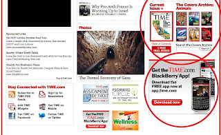
Keep house ads consistent with overall branding in terms of color, font, style. Above: An example from TIME.com.
LABEL HOUSE ADS
Clearly identify the house ad as coming from your company as opposed to a third party. Above: Examples of clearly labeled advertisements and house promotions.
The house ad began - and is still used as - a "filler" when ad sales had not been sufficient to fill available space. Typically it's used to promote the company, an ancillary product, or an event, such as a conference.
The shift in user perception of ads post-Web (can I trust this site? Can I trust this ad?) makes the house ad more powerful than ever. The key to success: Creating a close visual/messaging identification between your house ads and your primary Web brand. Why? Because your users came to *you*. They trust you.
Many site publishers err by thinking that they should make a house ad look like a third-party ad so "people will look at it." The sad truth is that people *will* look at it - then immediately dismiss it as an irrelevant ad.
Keys to success with house ads:
- Clearly identifying the house ad as part of your company - retain logo, fonts, visual design
- Labeling the ad "Offers from our company"
- Labeling third-party ads as "advertisement"
- Linking the ad to valuable content
- As with all ads, contextual placement wins.
Link your ad to valuable content to generate traffic - but make sure it's branded as you. Above: What looks like a third-party ad is really a house ad for a useful service to locate a cigar retailer in your area.
CONSISTENT STYLE
Keep house ads consistent with overall branding in terms of color, font, style. Above: An example from TIME.com.
LABEL HOUSE ADS
Clearly identify the house ad as coming from your company as opposed to a third party. Above: Examples of clearly labeled advertisements and house promotions.
Tuesday, October 27, 2009
The GOP Facebook Friendship Fairness app: Funny, or scary?
The new GOP.com has been thoroughly "reviewed" by the likes of Jon Stewart, who of course has comments outside the domain of this blog. The feature that captured my attention was the so-called Facebook Friendship Fairness app. From the site:
"How much longer will it be before you get the following notice from the new "Friendship Fairness Czar?
"How much longer will it be before you get the following notice from the new "Friendship Fairness Czar?
"Official Notice of Violation and Assessment of Friendship Tax:
"An audit of your Facebook account shows that your total number of friends is above the average of 120 friends for all Facebook users. The Friendship Fairness Czar has determined that you have an excessive and unfair number of friends and has devised a solution to spread the wealth of friendship. Please click on the Friendship Fairness Czar Facebook Application to be assessed your tax and become a fan."
Now, I know this entire site is attempting to present - literally - a new public face for the Republican National Committee. If that is the case, do they really want to lead off the Facebook initiative with the implication that they have snooped your Facebook account?
Privacy came to the fore in the last few years as social media collided with the "War on Terrorism." My take: If the RNC wants to create a new perception of itself - and this slick Web site starts to move it in that direction - maybe joking about privacy isn't the best way to go.
Just a thought.
Friday, October 23, 2009
How "nimble" should a Web site be?
Talking through Web strategy with a client today, we consider just how "nimble" a Web site should be - how frequently should a Web site redesign, based on changing mission priorities?
This is a particularly difficult question for large organizations with so much to say and no easy way to say it. Web sites that bend too far in the direction of the mission du jour may neglect content that is not part of that mission. The result for unsuspecting users may be "information paralysis," an overwhelming amount of content that could have been useful - had the user route been planned for those residing outside of the current mission priority.
Large associations and nonprofits frequently struggle with the challenge of meeting the needs of multiple constituencies. The solution is not to change the entry experience every time the organization takes on a new initiative; the solution is to create an information architecture that will continue to support known and ongoing constituencies, while creating a structural option that accommodates the changing initiatives of the future.
The time for "nimble" is in the planning and prototyping stages.
Wednesday, October 21, 2009
Least effective methods of online advertising
Online advertising felt the bite this year, with spending dropping in most areas. When budgets drop, it's even more important to spend limited dollars where you'll get the best return on investment. Below are a few of the least effective methods of online advertising.
These recommendations are based on best practices and current research. However, guidelines can't substitute for identifying and understanding your specific audience. Once you understand why the users are on your site and what they want to do there, you can provide better service and relevant, successful advertising that helps support your site.
Find out more about Interface Guru's user profiles and personas.
SIMPLE FLASH

Ads that use Simple Flash prove to be ineffective at driving purchase intent. A better choice is using rich media with video, which consistently ranks among the most successful methods at driving purchase intent. Above: Several simple Flash ads within the same page.
AD AS FRAME

Users have trained themselves to ignore ubiquitous ad types that frame content (banner ads, skyscrapers) - especially if they're animated. Above: A re-sized browser window would allow user to completely ignore the framing ads.
DELAYED BRANDING

Don't make users wait for it... they won't. You have mere seconds to resonate with the user, your message should be clear all the time. Don't play hard to get, hiding your brand and message until the end of the ad. Above: Company name is invisible throughout more than half of the 10 second ad.
Here are a few more resources to find out more about effective advertising:
• Google Analyzes Rich Media Ad Effectiveness (WebProNews)
• Online Advertising Spending Expected to Be Down for 2009 (AdAge and eMarketer)
• Video In Rich Media Ads More Likely To Lead Customers To Purchase (MediaPost)
These recommendations are based on best practices and current research. However, guidelines can't substitute for identifying and understanding your specific audience. Once you understand why the users are on your site and what they want to do there, you can provide better service and relevant, successful advertising that helps support your site.
Find out more about Interface Guru's user profiles and personas.
SIMPLE FLASH
Ads that use Simple Flash prove to be ineffective at driving purchase intent. A better choice is using rich media with video, which consistently ranks among the most successful methods at driving purchase intent. Above: Several simple Flash ads within the same page.
AD AS FRAME
Users have trained themselves to ignore ubiquitous ad types that frame content (banner ads, skyscrapers) - especially if they're animated. Above: A re-sized browser window would allow user to completely ignore the framing ads.
DELAYED BRANDING
Don't make users wait for it... they won't. You have mere seconds to resonate with the user, your message should be clear all the time. Don't play hard to get, hiding your brand and message until the end of the ad. Above: Company name is invisible throughout more than half of the 10 second ad.
Here are a few more resources to find out more about effective advertising:
• Google Analyzes Rich Media Ad Effectiveness (WebProNews)
• Online Advertising Spending Expected to Be Down for 2009 (AdAge and eMarketer)
• Video In Rich Media Ads More Likely To Lead Customers To Purchase (MediaPost)
Tuesday, October 13, 2009
Great ad - it's about relevant placement
Previously we talked about how important placement is in online advertising and how poor placement can make any ad bad. Now let's talk about which ad types are the most effective and bring the best return on investment.
NON-INTRUSIVE

"This could be good"
Ads that don't intrude on requested content don't annoy users. Text overlays on video windows take advantage of the un-used space without detracting from the desired video.
Above: A text overlay ad displays across the bottom of a video window without obscuring the content.

"I need one of those"
Users with "banner blindness" still respond to contextual advertising and good SEO. Users blind to popups and interstitials will still click on an ad when it's relevant to what they're already doing.
Above: Chart depicts ROI success per ad type.
(source: Marketing Sherpa and Ad:Tech survey)
RELEVANT

"It applies to me"
Online articles that include related brand information work well on younger users, who view them as more trustworthy than random banners. Advertisements relevant to what users are already looking at are more likely to get traffic.
Above: Graph depicts which ad formats users are most likely to respond to.
(source: ARAnet AdFusion survey)
NON-INTRUSIVE

"This could be good"
Ads that don't intrude on requested content don't annoy users. Text overlays on video windows take advantage of the un-used space without detracting from the desired video.
Above: A text overlay ad displays across the bottom of a video window without obscuring the content.
CONTEXTUAL

"I need one of those"
Users with "banner blindness" still respond to contextual advertising and good SEO. Users blind to popups and interstitials will still click on an ad when it's relevant to what they're already doing.
Above: Chart depicts ROI success per ad type.
(source: Marketing Sherpa and Ad:Tech survey)
RELEVANT

"It applies to me"
Online articles that include related brand information work well on younger users, who view them as more trustworthy than random banners. Advertisements relevant to what users are already looking at are more likely to get traffic.
Above: Graph depicts which ad formats users are most likely to respond to.
(source: ARAnet AdFusion survey)
Monday, October 12, 2009
Agile development and UX: The heart of the matter
Re my recent post on developers and usability:
So says Jeff Patton, and I couldn't agree more. No matter how you approach user experience, you must set aside time and resources for it. It has to be in the company DNA - even if that value must be ported from an offline discipline.
Agile development provides fertile ground for user experience design. It may not provide as much support for usability. Regardless, user experience design - most notably including user-facing information architecture and usability testing - must be accounted for in budget and schedule.
When user experience meets advertising: Are tradeoffs worth it?
The average American consumer is no longer. says Peter Francese, a demographer at the ad agency Ogilvy & Mather. No lie. Without even beginning to delve into the many facets of that statement, we can tell you that the sawed-off shotgun approach to advertising is dead. At a minimum, placement and context for advertising is key. Permission - anticipating the user's receptiveness, and when it will occur - is an under-served art online.
The power of data visualization
Great examples of data visualization ( telling the story in images, folks) at io9.com... using science fiction and zombies as accessible pop-culture data points, these information graphics provide excellent examples for reuse in business. Science with a sense of humor. For a more serious take, see C-SPAN's visualization of participation in the presidential debates.
Why are we writing about this? Because in the age of infinite channels, visuals offer an immediacy that words cannot. Saying "the United States is polarized" does not have as visceral an effect as viewing a daily visualization of polling data.
Visualization takes on new power in the torrent of information available to much of the world's population today. Our recent usability testing has shown a predilection towards visualization among younger users; this may indicate a different yet sophisticated way of thinking. Government and military are developing greater visualization capabilities into computer support for emergencies and deployment. Complex sets of data challenge the best and brightest, who see the value of creating visual systems to contextualize the meaning of data.
Consider doing the same with business data, especially online.
Friday, October 9, 2009
Bad ad - it's all in the placement
In our view, good advertising doesn't turn off your users and drive away traffic. Don't bash them over the head! Attract users with smart ad choices that make it clear you value them as much as you value advertisers.
TAKEOVERS

POP UPS

"I didn't ask for this."
The ad shouldn't be the first thing seen on your site. Once users have enjoyed your unique content, they're more likely to respond to relevant ads.
POOR PLACEMENT

"Where can I go?"
Obscuring navigation implies that ads trump your original content. And it prevents users from reaching what they came for.
TAKEOVERS

"Who are you?"
Would you plaster a billboard over the signage at your company's headquarters? Keep your masthead visible so users know who you are.POP UPS

"I didn't ask for this."
The ad shouldn't be the first thing seen on your site. Once users have enjoyed your unique content, they're more likely to respond to relevant ads.
POOR PLACEMENT

"Where can I go?"
Obscuring navigation implies that ads trump your original content. And it prevents users from reaching what they came for.
Wednesday, October 7, 2009
Do bad things happen when developers design user interface?
We work with some incredibly talented development teams around Web sites, Web applications, and software projects. Unfortunately, teams missing a user experience specialist often find that they cannot come to consensus on what the user interface should look like, or what it should do. This leads to a sub-optimal user experience, with the common result being that powerful software functions are invisible to the user. That wastes money - and obscures the excellent work of your team.
The cost to business of skipping the critical planning stages - which include user profiles, usability testing, information architecture, user interface design and task sequence design - is incalculable. Skipping these steps means endless hours of expensive meetings where everyone has an opinion, but few have real data.
Stop for a moment and consider the areas of expertise your employees own today. Is there someone on staff with formal training in user interface design? Information architecture? Task sequence design? If the answer is "no" or "sort of," it's time to start adding up the cost of all the hours spent in meetings with no consensus, so you can reallocate those funds to usability training or professional services that will bridge the gap.
Sunday, October 4, 2009
Relationships, ethics, and collaboration
Are attitudes about ethics and relationship changing - or are they just more visible in the Net-enabled world? Take this quiz and see how you score. In my world, relationships must be based on the presumption of ethical behavior. You may say I'm a dreamer... but there is a business consequence to ethics or the lack thereof.
DARPA and the Internet, official version

Awesome 1969 drawing of the ARPA network, which became the Internet... Since we were on the topic of DARPA... of course the history of DARPA and the Internet is in a PDF... but you've got to love the simplicity of this sketch.
Jay-z a Masonic initiate? The power of symbols in paranoid times
I must confess I was surprised to hear NPR cover the "is Jay-Z a Mason?" story in conjunction with the current Dan Brown frenzy. I'm not a fan of Brown's, but he is to occult tradition what Carl Sagan was to astronomy - not the greatest scholar, but the most effective popularizer.
The Freemasonry allegation, which has surfaced before, is that the imagery used in the "Run This Town" video directly alludes to the influence of that secret society. Vigilant Citizen offers a visual discussion of the topic, and the comment that the lyrics imply "an imminent change that might terrify or enrage some people" is of interest in light of the recent Town Hall hysteria. What might that change be? A perusal of the blogs confirms that the terms "Freemason" and "Illuminati" are hopelessly confused in the public mind, which does not of course preclude wild speculation and ridiculous conclusions. What we can state with certainty is that when times are hard, people look for a reason; the notorious All-Seeing Eye and pyramid, passed daily on our very own dollar bills, remains a powerful symbol that can represent paramount understanding, or the ultimate in conspiracy. How we choose to use it at any given point in time is a clear mirror of our collective hopes and fears. The use of the eye and pyramid in the Total Information Awareness logo was disturbing enough to put the brakes on the Bush administration's then-unstoppable snooping efforts, as detailed in a memo from DARPA. There is something so potent about the symbol that it calls into question any who adopt it. So what does this mean? The idea of the ultimate conspiracy - the entrenched refusal of the powerful to collaborate with the powerless - could certainly be credible in light of current news. Yet this suspicion on the part of the less fortunate - that the deck is deliberately stacked against them - has survived many eras. The pity is for society, which loses when its citizens lose faith.
CDC test of social media: Complexity makes usable design a challenge
Check out the concise summary of "social media usability testing" conducted by the CDC. Covering MySpace, blogs, widgets, e-Cards, and podcasts, the study points to the unsurprising conclusion that complex products - such as widgets - must meet a higher standard of usability and credible user experience.
I'll bracket that statement with two statistics from the study. First the e-Cards: "100% participants worry about viruses/spam." Which, of course, influences the decision to open the e-Card. This is what our Usable Times 5 methodology would describe as a Permission issue - as in, "I did not give you permission to send viruses or spam to my computer." Of course the Web site does not explicitly say it will send viruses or spam. But it doesn't reassure users that they won't have to worry about them, either.
Second, the widget, which only 45% if respondents were able to share and download, caused users to "struggle." Again, a reduction in usage, for different reasons. The loss here is in the development time for that widget, which is then under-utilized due to poor task sequence design. The presentation of user interactivity required for interaction with the widget is not straightforward enough for this user base. Interactivity is another Usable Times 5 factor.
The usability test report also discusses problems with adjacency of controls (instructions for use of podcasts too far from the action button, counter-intuitive "save this file" labeling). This is a common problem easily revealed in usability testing, and solved in user interface design.
The best news: "Visitors who use our new media products are more satisfied
with their visit to CDC’s Web site." That encourages all of us to continue the development of the many diverse expressions that currently fall under the rubric of social media. But these findings also point out the significant gap between the products we create and the user's ability to understand them without us there to explain them.
The need for information design on all digital products remains unmet.
The study, created by Sarah Greer, Catherine Jamal, Mike Peltz
and Cari Wolfson of the CDC's Division of eHealth Marketing, gets kudos for its frank look at CDC's current usage of media tools. No surprise to find FDA's Sanjay Koyani thanked at the end - he was among the first to create Web user experience standards in 2003 with the Research-Based Web Design and Usability Guidelines.
Tuesday, September 29, 2009
So that's why government has no time for usability analysis?!
Slashdot reports a Washington Times story claiming that one senior executive at a government agency spent at least 331 days looking at pornography on his computer. It's important to to remember that the Sun Myung Moon-funded Times has its own very conservative axe to grind. But if this is true, I wonder if it's a contributing factor to why many government Web projects seem to have no requirements for the evaluation of digital media while funding same.
The larger, sadder, more expensive issue is the ongoing loss to American government - and business - from poor use of technology. Bad decisions, bad builds, lack of objective evaluation. No oversight. No accountability.
The for-profit world moves too quickly for its own good sometimes. The non-profit and government sectors may not feel the same sense of urgency. Time for them to address important issues - like why technology projects need a plan, a purpose, and objective evaluation. We've expressed this sentiment in many environments; it seems to fall on mostly deaf ears. Fiddling while Rome burns, or rather, supporting poor overseas online sex workers (the executive's excuse).
Monday, September 21, 2009
Execs give Web 2.0 thumbs-up? Doh!
"Companies that use social media applications say they’ve seen clear benefits from the technology." - McKinsey via Elizabeth Lupfer's The Social Workplace. Check out video sharing numbers - way in the lead. Given what our usability studies have shown recently, no one reads any more, so this explains it. Sort of.
The "big numbers" all revolve around the sharing of knowledge - speed of knowledge acquisition, effectiveness of marketing, reducing communication costs.
Many Web evangelists have spoken to the power of social media. The McKinsey imprimatur may reach those last holdouts who refuse to play. The real hidden value: Boosting the brand, which is harder to measure; its presence is inarguable regardless.
Regardless, check out Elizabeth's savvy site, formerly Geeky Grrl. She's got an incisive combination of wit and expertise. She's also the most hilarious dinner guest of all time.
Tuesday, September 15, 2009
NY Daily News: Web's worst offender for intrusive ads?
 Worst offender: Best Foods ad that can't be closed AND covers content. I promise to boycott this brand forever.
 The temerity to cover the entire masthead. UNbelievable.
So, what's up at New York Daily News? I have not seen such an onslaught of intrusive ads in, well, ever. They cover the masthead. They cover content. AND you can't close them. I would love to see the metrics on these ads, then I'd love to test it so I could demonstrate just how many of those vaunted click-throughs are actually invoked by users trying to exit these ads = which break every rule. I feel as if I just had to toss four pushy salespeople out of my living room. I bet a lot of readers at http://www.nydailynews.com feel the same way.
Ads that interfere with navigation are bad for everybody

Can we all agree that ads should not display in front of dropdown navigation? Check out this Suave (not) leaderboard covering up top-level dropdown navigation. By the way, the nav on the left of the page does not correspond in any sane way to the dropdown nav, so God help you of you actually want an alternative way to find that item you now can't reach in top nav. Who wins here?
Bamboozled by Wacom's set-up UI

I finally got round to setting up my Bamboo graphics tablet from Wacom... probably the sixth Wacom I've owned. Love the product, package design, functionality. Here's the glitch: You have to run the visual tutorial to set up the tablet and pen (okay), but what happens when the UI locks up? I got a Director error twice, restarted the tutorial, and was finally stymied by a "press space bar to continue" dialog. This is a great tool, but the tutorial for install of the product suffers from overdesign. I understand that someone designing a tutorial for this very slick product would be tempted to make it as cool as the tablet. But you know what's *really* cool? When you can actually complete the tutorial without aggravation.
Friday, September 11, 2009
"Perhaps the next iPod will send telegraphs and teleport people."
Alison Southwick quoted in the LA Times: "Perhaps the next iPod will send telegraphs and teleport people." Ripples in technology, forward and back? Maybe the next iPod will feel like steampunk.
My friend Dan Rosenbaum, eyewitness to 9/11
My friend Dan Rosenbaum is a true friend. The kind you slug it out with, just to realize you can't live without them. We met in New York at FOLIO: Show 1999, so it is our tenth anniversary of friendship.
I learned a lot from Dan, about business and the Web world, where he's a true pioneer. One of the best nights of my pre-Web-crash life was at Jack Powers' Internet World LA party in 2000. Dan wore a suit, I wore a black vinyl ballgown, and we all exulted in the rush of the Web.
Dan is a devoted husband and father. On 9/11, when Olivia was pregnant with their twin sons, Dan had an eyewitness view of the maelstrom at Ground Zero. I will never be the writer Dan is, so I will let him tell you the story of what he saw on 9/11.
Always remember. Never forget. Happy birthday, Dan.
Wednesday, September 9, 2009
Top 1 Percent of Americans Reaped Two-Thirds of Income Gains in Last Economic Expansion
The Center on Budget and Policy Priorities reports: "Two-thirds of the nation’s total income gains from 2002 to 2007 flowed to the top 1 percent of U.S. households, and that top 1 percent held a larger share of income in 2007 than at any time since 1928, according to an analysis of newly released IRS data by economists Thomas Piketty and Emmanuel Saez." Why am I writing about this? Because the long-term implications for the digital divide in this country, and thus American competitiveness, are appalling.
"The incomes of the top one-tenth of 1 percent (0.1 percent) of U.S. households have grown more rapidly than the incomes of the top 1 percent of households as a whole, rising by 94 percent — or $3.5 million per household — since 2002." This surpasses 1928 data.
If people want to scream and cry at Town Halls, or about the President addressing schoolchildren, it seems to me that they should be screaming and crying about THIS. Who is addressing this grotesque inequity?
Even if those at the top of the economic food chain don't have the ethics to see this inequity as wrongheaded, they should at least have the pragmatism to understand they will lose the consumer class that fueled their success. Once people are too busy surviving, they won't be spending. Look around you and ask yourself if this is the state in which we should be living.
Tuesday, September 8, 2009
Bad Web Site of the Day: Trinity Railway Express


I literally keyboard-stumbled on to this Web site today and was frankly amazed to see something as outdated as Trinity Railway Express - check it out at http://www.trinityrailwayexpress.org/. Hard to believe that a company offering rail service between Fort Worth and Dallas can't afford a better Web site. The best thing about trinityrailwayexpress.org is that it links to Fort Worth Transportation Authority's the 21st-century Web site, http://www.the-t.com. Trinity, we can help.
Consequential strangers: An underpinning of social media?
While I don't like the title of the book (Consequential Strangers: The Power of People Who Don't Seem to Matter - But Really Do), I was compelled by the argument. "The term 'consequential strangers' captures a fascinating paradox about casual relationships: They are as vital to our well-being, growth, and day-to-day existence as family and close friends." Author Melinda Blau, interviewed by NPR's Neal Conan, explained that we may be likelier to find validation in our relationships with relative strangers than within "close" relationships. People are even likelier to accept advice on serious topics like relationships and health issues from "strangers."
This makes perfect sense to me. This is a significant part of what fuels social media. Many consider social media to be an exercise in narcissism, and it certainly can be. For me, it has often provided a way of expressing myself when calling a friend and making the same statement seems like an intrusion. Perhaps the tree wants to be heard when it falls in the forest.
This makes perfect sense to me. This is a significant part of what fuels social media. Many consider social media to be an exercise in narcissism, and it certainly can be. For me, it has often provided a way of expressing myself when calling a friend and making the same statement seems like an intrusion. Perhaps the tree wants to be heard when it falls in the forest.
If Facebook were a country, it would have the world's fourth largest population
Interesting discussion on how the over-35 online audience has fueled the growth of social media. NPR Science Friday's Ira Flatow interviewed Sean Corcoran of Forrester Research last week. On Facebook: "If they were a country, population-wise at this point globally, they would be number four behind China, India and the United States." What can we do with this unchanneled power? Only 30% of usage is from the US. Follow this always-worthwhile show on Twitter @scifri, or better yet, join the Second Life meeting concurrent with the show. Great combination of intelligence and snarkiness. It's one of my favorite spots in Second Life.
But back to Facebook. What will all of us do, collectively, with the power of the network? It could be argued that we (social media users) are already a nation.
But back to Facebook. What will all of us do, collectively, with the power of the network? It could be argued that we (social media users) are already a nation.
Saturday, September 5, 2009
Southwest Airlines extends great customer service with call-backs
Once again Southwest Airlines proves they get customer service, and the way you think. If you are going to be on hold for more than three minutes, they allow you to leave your number and recorded name, and they tell you EXACTLY how long it will be before they call you back ("three to six minutes" in this case). When they call back, they use your voice recording to say, "when this person is on the phone please press 1" (which means they realize the caller may not be at their regular number). They called me back before I had a chance to finish this post, and I will continue to choose them first! Spiffy new site design, too: Makes you look forward to flying, instead of dreading it.
Thursday, September 3, 2009
Why it's crucial for social networks to make privacy obvious
In today's Science Daily: Many Online Social Networks Leak Personal Information To Tracking Sites, New Study Shows. Science Daily does an excellent job of explaining the technology; our usability studies show that users are acutely aware of being "tracked" in some way. This is as true of the 13-year-old "digital native" as it is of older late-adopters. If you want people to adopt your social network, you MUST declare privacy policies - particularly at interaction points such as registration fields and profile set-up forms.Kudos as always to Science Daily.
When FREE is a lie - personal info and privacy, astrology.com


Back to my favorite (of late) whipping boy, astrology.com: This iVillage site should not assume its loyal readership will stick around. The outdated visual design now suffers even more from intrusive advertising that I close immediately (if a popup). The term FREE on "today's three special offers!" is deceptive, because as soon as you click through, you will see it -is- FREE - but you must submit personal information, which these days is worse than asking for money. How many people exit the transaction at this point? iVillage, are you looking at your stats?
Word on the street is that astrology.com is about to face some stiff (and contemporary-looking) competition. Time to review metrics, conduct usability testing, and redesign this very outdated interface. I visit regularly and it seems someone has decided to experiment with varying placement of elements on the home page.
Other problems on astrology.com: No dates on items like Tarot readings. If today's cards are the same as yesterday's, why should I trust the site?
In closing: Clicking through to the Numerology offer, which requests full name at birth and full name used today, as well as email, does not offer a visible privacy policy. Oh, and the browser window titles don't match the pages.
iVillage's success with this site is at risk.
Tuesday, September 1, 2009
Are publishers killing Web advertising? Yes!
Are publishers killing Web advertising? We think so. Check out this piece on how publishers are killing Web advertising by Jim Spanfeller, the outgoing president and CEO of Forbes.com . Spanfeller argues that the industry is devaluing its own online ad presence, and we agree. "A publisher can and should price their inventory at levels that will meet the market expectations and drive their business model. What they should not do is allow some sort of invisible hand (or should I say hands) to price their inventory against a backdrop of objectives that can and often does change at a moment’s notice. This practice has fundamentally driven pricing down across the web and, perhaps more importantly, changed the success metrics from ones based on 'demand creation' to ones driven by 'demand fulfillment.' " Amen! This is what happens when you don't have a Web strategy, which means you have no ad strategy. We see this disastrous trend in too many places. How is your company addressing this issue?
. Spanfeller argues that the industry is devaluing its own online ad presence, and we agree. "A publisher can and should price their inventory at levels that will meet the market expectations and drive their business model. What they should not do is allow some sort of invisible hand (or should I say hands) to price their inventory against a backdrop of objectives that can and often does change at a moment’s notice. This practice has fundamentally driven pricing down across the web and, perhaps more importantly, changed the success metrics from ones based on 'demand creation' to ones driven by 'demand fulfillment.' " Amen! This is what happens when you don't have a Web strategy, which means you have no ad strategy. We see this disastrous trend in too many places. How is your company addressing this issue?
Monday, August 31, 2009
Blogger vs WordPress for hosted blogging - Blogger wins
Must say that Blogger had superior quick-start functionality compared to WordPress for hosted blogging. Why aren't we hosting our own blog? Because our site's under construction and the stimulus package is gummed up in the works. Here's our thumbs-up for ease of use - although something is certain to bite us in the derriere later.
ACLU app and Facebook privacy

The American Civil Liberties Union (ACLU) brings your privacy on Facebook front and center with its What Do Facebook Quizzes Know About You app. People who are concerned about privacy on social media sites often don't realize that Facebook makes no guarantees on what data those cute little apps are mining, or how it's used. Read this great article about Facebook knowing too much about you in the San Jose Mercury News.
Our Web Strategy poll on LinkedIn
Do you have a Web strategy, or is the sheer existence of your Web site the strategy? Please take our brief LinkedIn poll and tell us where your company or organization stands on this crucial topic. If you're not a member of LinkedIn, you should be!
Where's the hurricane, weather.com?

Looks like we in the Southwest wont have to worry about any pesky Cat 4 hurricam effects later this week, according to Weather.com's forecast.
Subscribe to:
Posts (Atom)
